Have you read Henry Cooke‘s excellent piece on the Unintended Consequences of the way we design digital products and services? If you haven’t, go read it now. I’ll wait.
Ready? OK. It was when I read this bit that I started to scribble on a post-it note:
“We are encouraged to think of our audience as being fickle, easily distracted, with the attention span of a puppy, so we should make our flows and interactions as friction-free as possible. ‘Don’t make me think‘.“
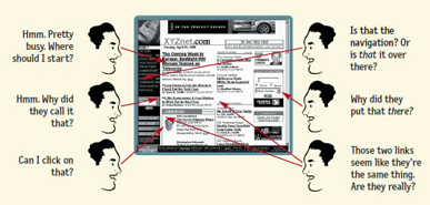
The book referenced in that paragraph was originally published in 2000. Its purpose was emphatically not to hook hapless users into a cycle of attention-dependency; its purpose was to help the people who designed digital products and services back then (when they were quaintly called ‘websites’) make those things usable by non-technical folk. Here’s an illustration from the author’s website:
The thing is, Hank’s right – this fundamental and well-respected work is now being referenced (I’d argue inappropriately) to encourage shady, manipulative design practices. Though Krug’s fundamentals of usability continue to hold true, when we talk about designing for habitual use, or about the attention economy, I don’t think we’re talking about usability so much as ensnarement – we’ve gone from ‘don’t make them think’ to ‘actively discourage them from thinking so they won’t leave’.
Put another way, almost everything about the way we engage with technology has changed or evolved; surely this means we need new design principles to cope with these new modes. That doesn’t mean the old ones are (all) broken. It does mean that the digital landscape of any individual is far more complex and embedded in their lives than it’s ever been before, certainly exponentially more than it was 15 years ago.
15 years ago, technology was peripheral to most people’s lives. Early adopters could do their banking online, and if you worked in the corporate world you probably had an email address; still, less than a quarter of Americans had ever bought something online – most of life for most people was still conducted in the ‘real world’. Now, every aspect of our lives, from communication to transportation, entertainment to infrastructure, is at least partly facilitated by – if not completely subsumed in – digital interfaces. Increasingly, digital technology is the ‘real world’. Surely such massive change in our relationship to technology should elicit a corresponding change in the way we think about designing that technology. Usability is still important, but other things are now, too. Things like mindfulness and ethics. Things we didn’t used to have to think about quite so much.
We in the tech world often bemoan how slow legislation is to catch up with the things we’re making, but even our own rules and methods are becoming fossilised and misused. We make fun of the Luddites who can’t set up their own web hosting, but in our own special little ways, we’re dinosaurs too, clinging to the old ways of doing things even though our world is changing every day.
I’ve written before about the danger of false expectations and the need for us to think about technology as assistive rather than autonomous. I’ve also ranted on many occasions about the need for productive friction, or ‘beautiful seams’ in services and systems. These are ways to keep tech from being creepy, or overbearing, or annoying, or even destructive.
I very much agree with Hank that empathy is the key. I also think systems thinking is the map to the territory that key unlocks. Yes, it’s both necessary and useful to acknowledge that there are others out there who do not share one’s point of view. I’ll take it even further and say there are people out there whose experience of the world is so different that I could not effectively imagine their perspective on the thing I’m designing. And that is perfectly ok. That does not mean I should exclude them from my design. This is why designing to limited user journeys isn’t good enough anymore – users should be free to use digital products and services in whatever way they think best (within the confines of the law, etc.), not just how I, the designer, can imagine them being used.
Underneath this question of empathy and responsibility in design is the question of normative systems. We humans have a deep need to fit into a group or community – it’s part of our evolutionary biology. A side effect of this is a tendency toward the normative when we design systems for mass consumption. But as technology permeates an ever larger proportion of our lives, this leaves less and less room for individuality. We (intentionally or not) lock our users into the patterns that we deem acceptable, and those who don’t fit are called outliers or edge cases and broadly ignored. That may be ok if you’re making something that’s optional, but increasingly we’re talking about systems – city infrastructure, home utilities, wearable medical technology – that will be difficult to avoid. Do we want to relegate those who fall outside the norm to the sidelines? Do we have the right to do so?
Mavericks have been among our greatest innovators, driving cultural, scientific, philosophical and technological change for centuries. Normative tendencies in the ‘disruptive’ world of software design can’t be a good thing for innovation overall. The idea that we are unintentionally making software a normative sociological force makes me profoundly uneasy.
I’m all for simplicity, but I’m even more for human-centredness. To paraphrase Einstein, we need to make the things we design as simple as possible, but no simpler. And though the questions of ethics, responsibility and individuality are far from simple, they musn’t be ignored.
